Allcare Pharmacy - Pharmacy Rebranding
Enhancing a Household Name

As more people began turning to their local pharmacy for everyday healthcare, Allcare recognised it was time to evolve. The brand was trusted and familiar, but its identity felt dated, lacking the clarity and warmth of a modern health destination.
The challenge was to refresh, not reinvent, keeping the equity Allcare had built while creating a contemporary, flexible identity that could roll out seamlessly across every store.
The Task


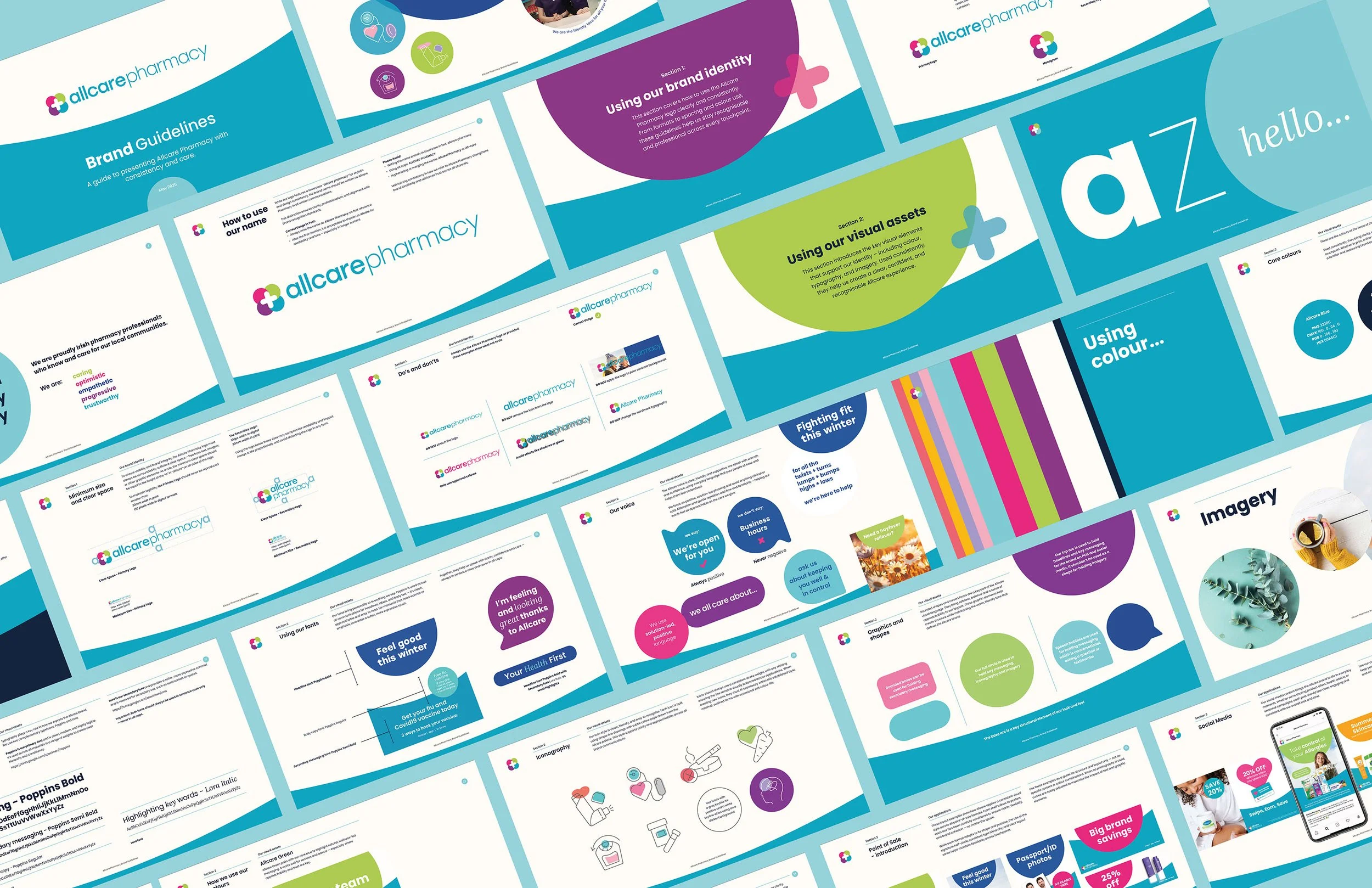
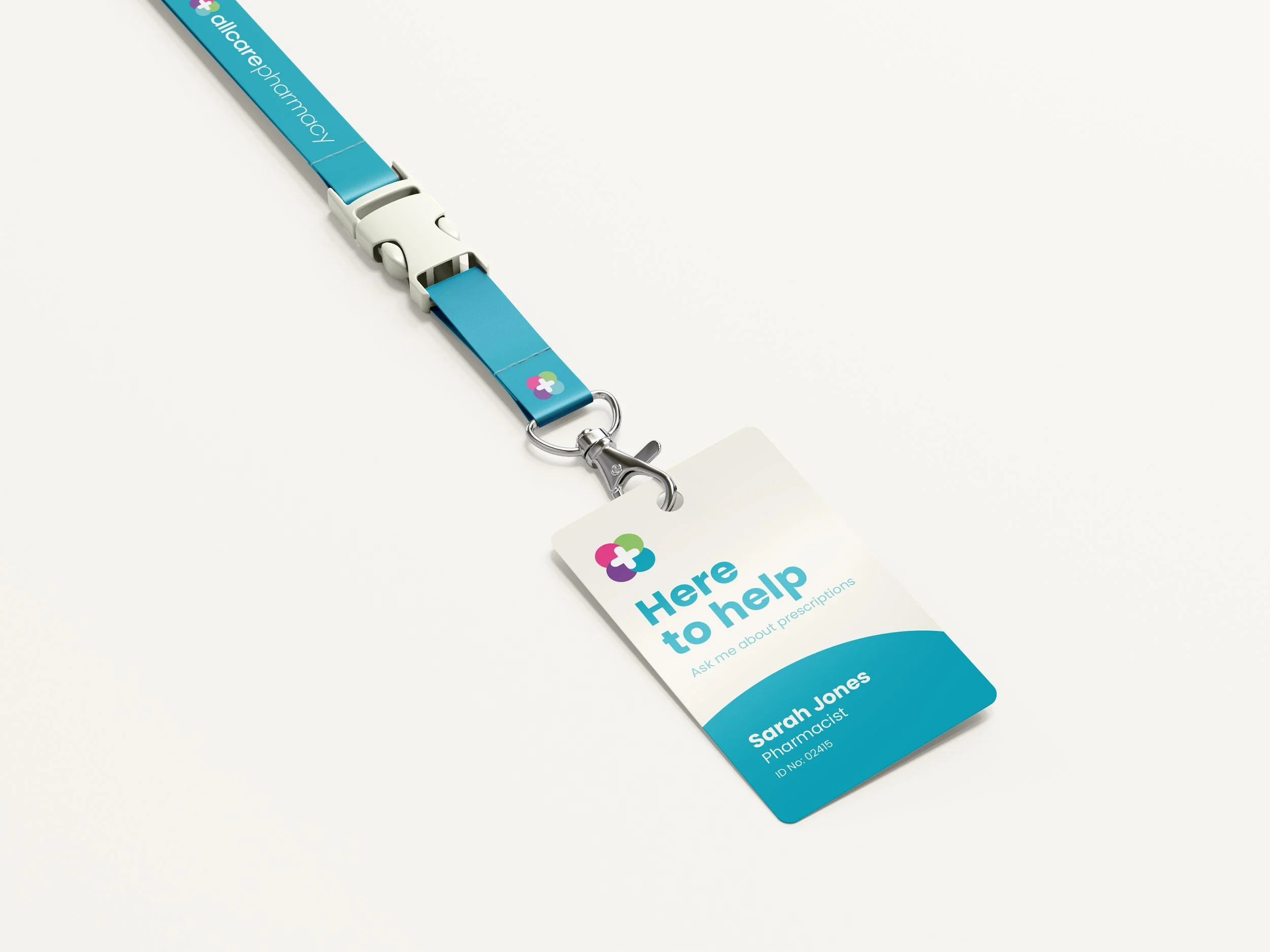
We reimagined Allcare with a lighter, more human touch. Refining what already worked and removing what didn’t. A simplified logo lock-up, brighter colourways, and clear, welcoming in-store messaging came together to form a more confident, connected identity. Every detail was designed to feel cared-for — practical to roll out, but full of warmth and optimism.
The Idea
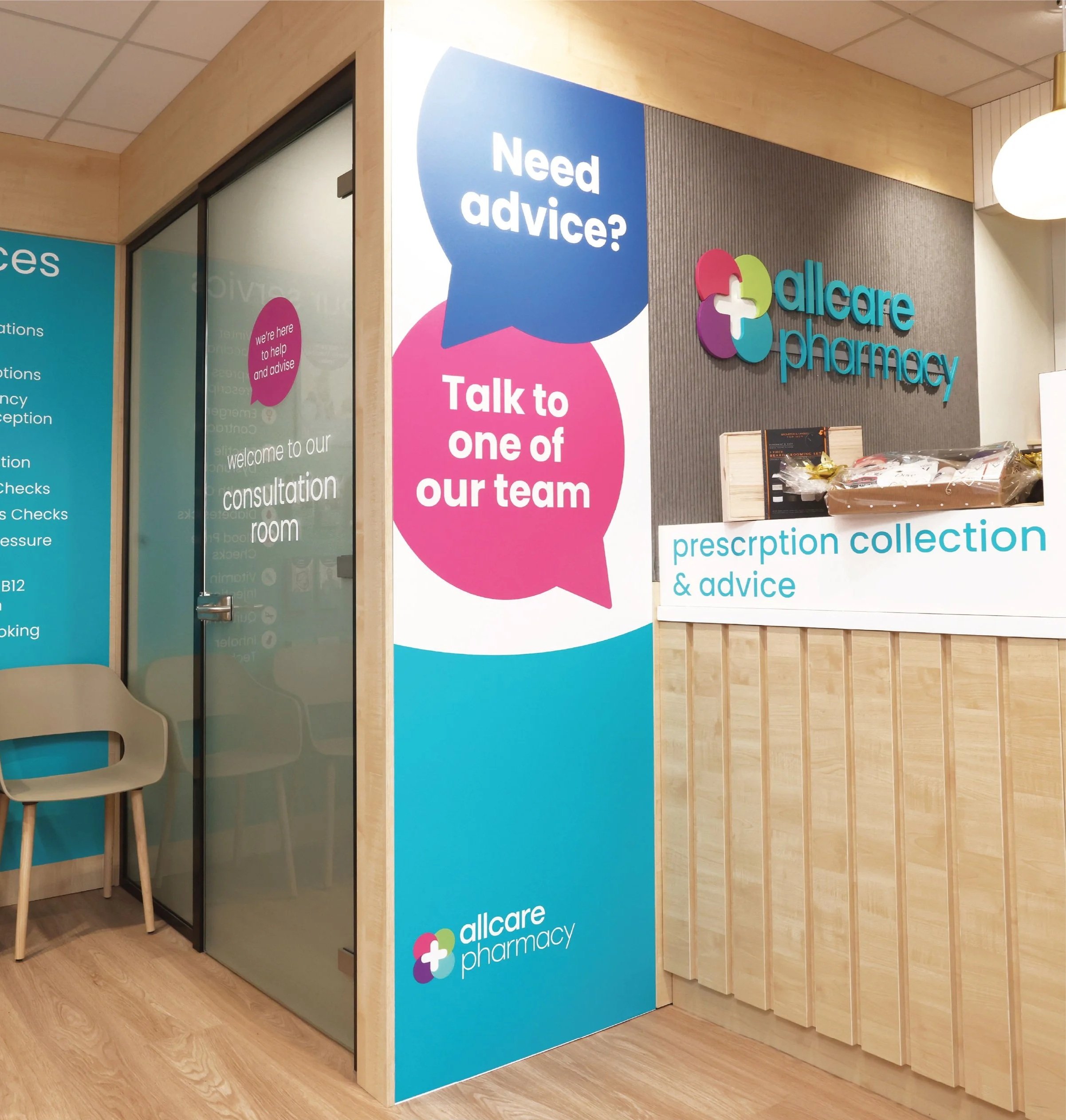
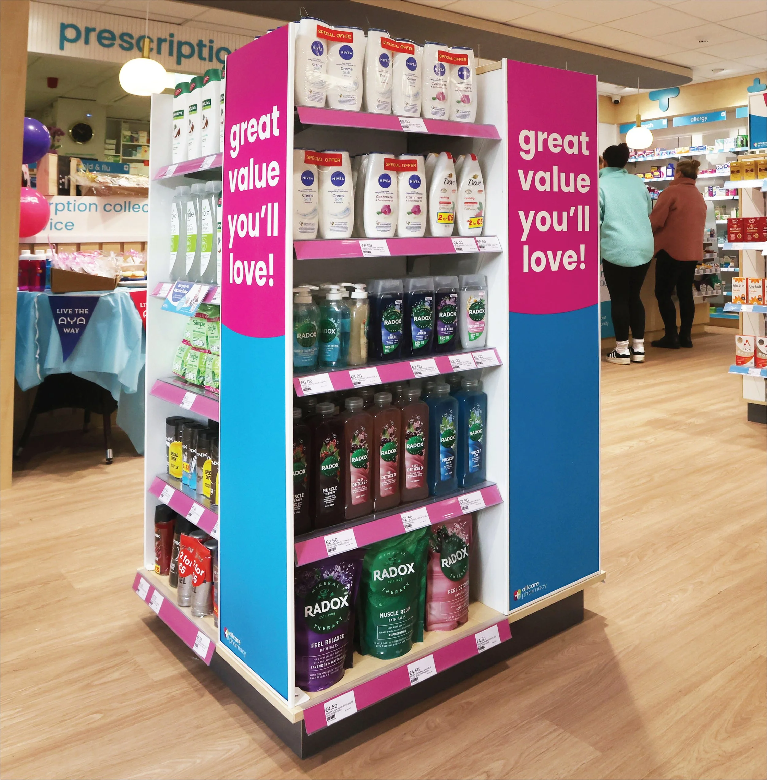
Across point-of-sale, we focused on creating impact through clarity and simplicity. Clean layouts, balanced colour use and well-paced messaging makes the space easy to navigate without overwhelming customers. The tone feels calm and reassuring, with promotions and guidance presented in a clear, accessible way.


The Result
The refreshed identity maintains brand trust while making Allcare more relevant to today’s pharmacy customer. With improved consistency and a warmer tone, the brand now supports a seamless experience across locations — helping Allcare grow its presence in local communities with confidence.