Tims Dairy - Yogurt Branding
A big dollop of design joy
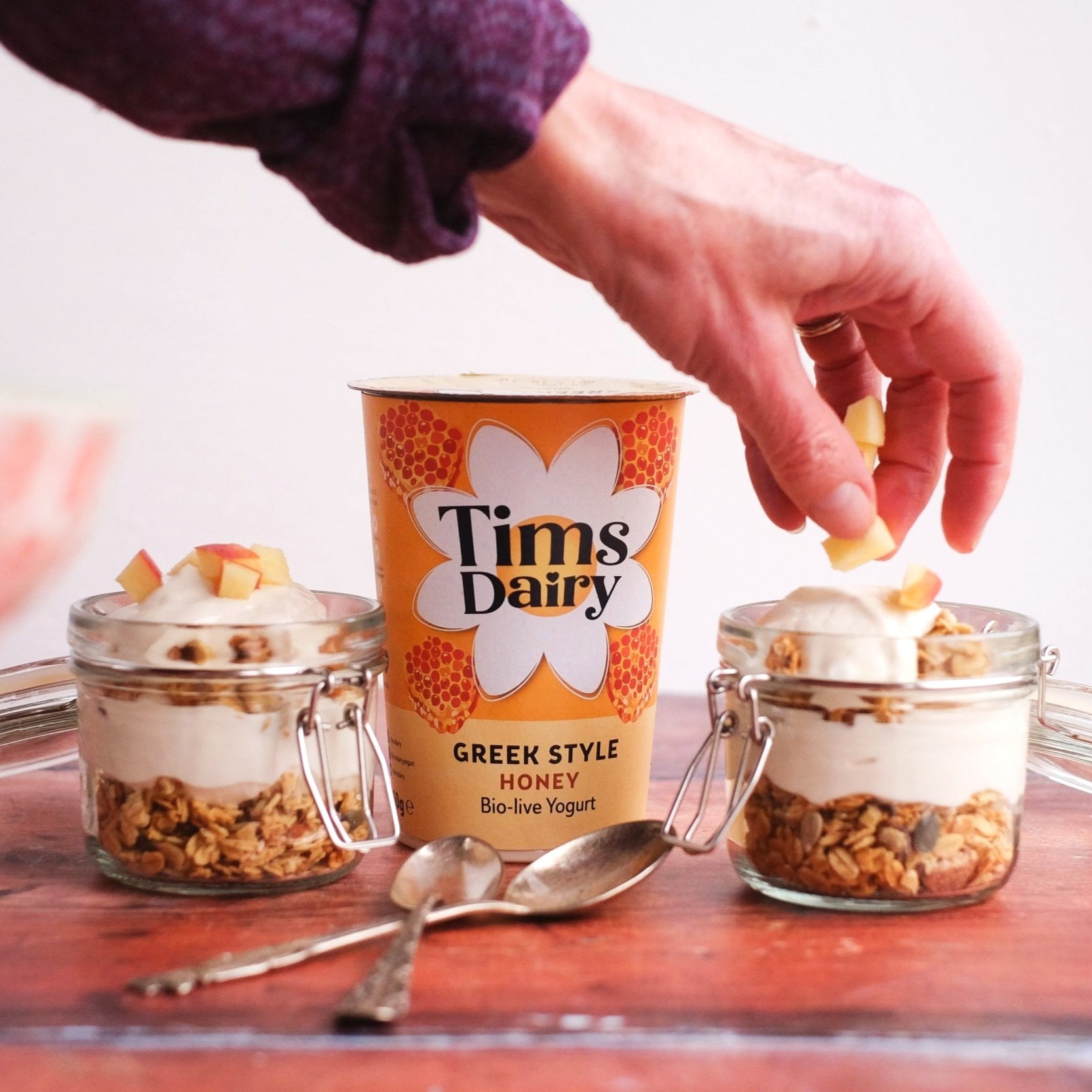
The best tasting Greek Style yogurts anywhere on earth (Honestly. They really are that special). With a pack design to match.

The Task
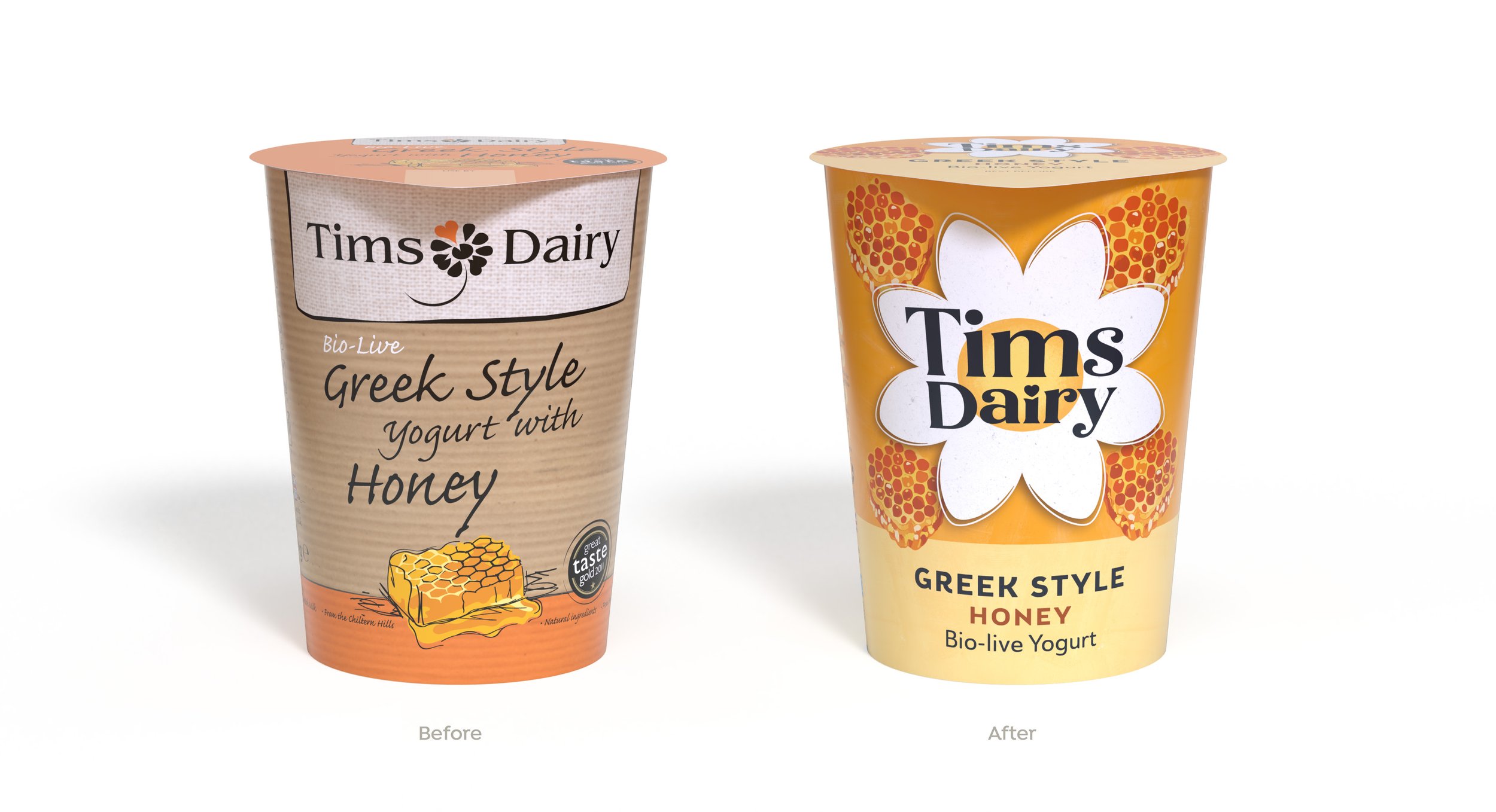
Family owned Tims Dairy (established since 1949), wanted to create a fresher, feel good, optimistic look for its amazingly tasty yogurts that would stand out and deliver clearer on pack messaging.


The Process
A factory tour and tasting with all the Family convinced us that this is indeed the best tasting Greek Style yogurt. And it gave us lots of ideas.
A brand idea of Nurturing Something Really Special was landed on. This gave the inspiration to develop some creative territories that stimulated a range of design concepts – from a tidy up of the existing design to something more adventurous.
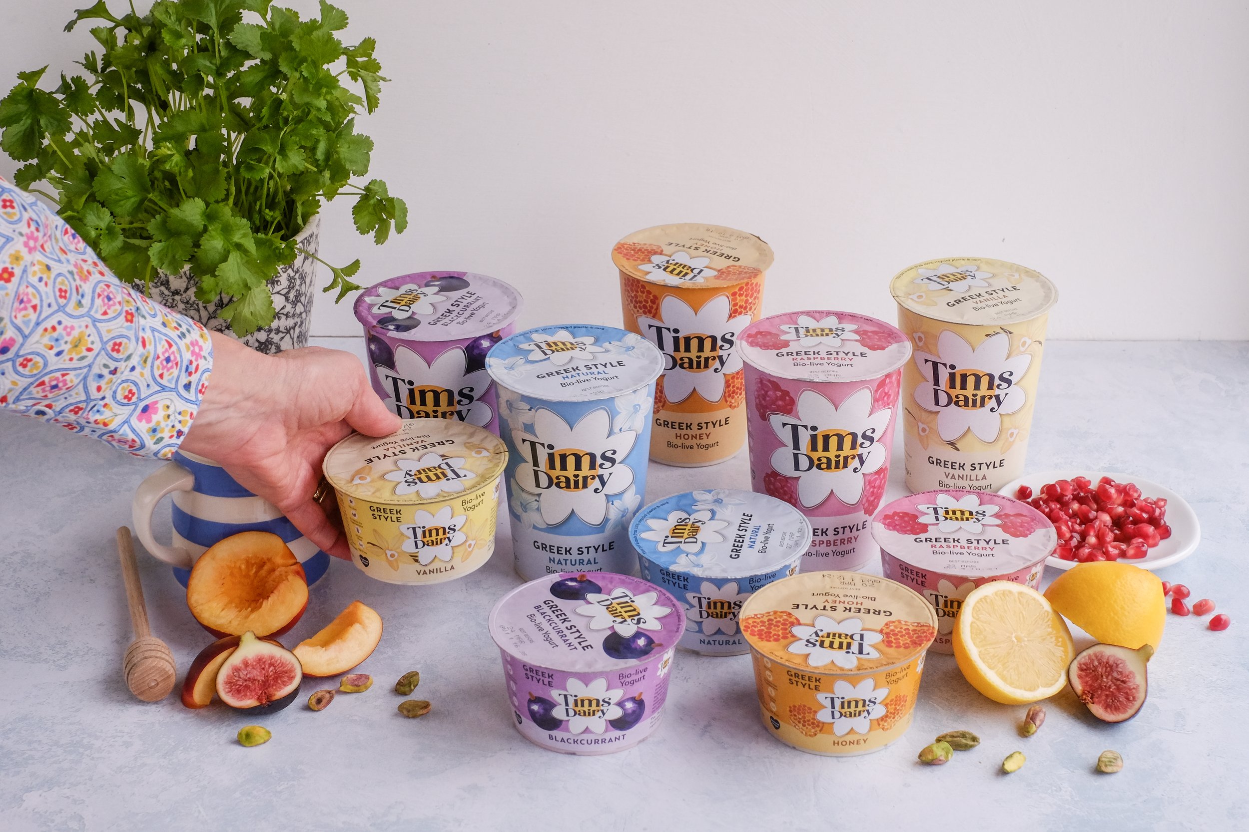
The exploration was careful to use the established visual equities of the brand that included the daisy, the type styling and hand drawn illustration feel.
One of the more adventurous designs was selected using a combination of internal feedback as well as trusted business partners and customers. This was refined and applied across all retail and foodservice ranges.
The Result
A transformation in brand appeal. Retail sales increased impressively and was helped by a brand new listing from Sainsbury’s. Tims has just partnered with the famous Tiptree jam makers to produce a delectable Strawberry Royale for the Queen’s Jubilee.